


The Art of Adventure Covers
An In-depth look at the lost beauty of pulp art

Editor’s Note:
Today’s featured submission is a guest essay by Brina Williamson, author and illustrator, exploring the often-overlooked aesthetic merits of pulp art. Presented below is an essay that serves as both a tribute and a detailed lesson from an experienced practitioner in this celebrated art form.
Brina is the author and illustrator of the Merona Grant adventure series, which is currently being adapted into an audio drama. At the Cusco Webfest, the pilot episode received four awards, including Best Fiction Podcast; it also received four nominations at the Los Angeles Webfest, with a nomination for Best Drama Podcast. They launched a Kickstarter campaign to raise funds for the project.
Enjoy,
Frank Theodat, Editor
I was honored to be asked to talk about such a cool subject as pulp art, and what makes a great pulp adventure book cover! So, let’s dive in!
Since childhood, art has been a passion of mine. I could always be found carrying my sketchbook around, drawing anything and everything, and very soon, those little sketches began to inspire ideas for stories, kicking off my love of writing.
As an author, I work to create strong visual covers for my books that will inspire the imaginations of my readers like they did for me.
I’ve done a lot of work on various book covers and illustrations in my career as a freelance artist, for books in all kinds of genres, which often require some research to familiarize myself with the stylistic cover conventions of a genre.
Naturally, when I started writing my first pulp adventure, Merona Grant and the Lost Tomb of Golgotha, I wanted to make sure my cover spoke to the genre and told potential readers exactly what they were getting.
So, I started doing my research on pulp covers of old, and new, and tried to capture that look, but with an updated twist that felt a bit like a movie poster you might see for classics like Indiana Jones or The Mummy.
I started researching the genre by consuming as many films, books, and games as I could find, not only to inspire my writing, but also to expand my knowledge of the visual art and expectations of the genre.
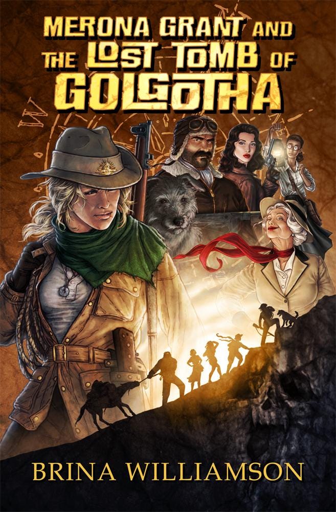
One of the things I made sure to feature on my cover was a bold, yellow/gold title font, since bold lettering in yellow or red seemed to be the most common choice on old pulp magazines or movies.
This particular font had an aspect of interlocking letters, which felt a little like puzzle pieces fitting together, and since solving puzzles was key in many parts of my story, it felt like a perfect fit.
In pulp art of old, there is often a strong use of primary colors (red, yellow, blue) but as you explore more modern adventure covers, the use of oranges and greens is much more prevalent.
I opted for a more contemporary color palette, but still with the bright yellow title and a little pop of red on Lady Woolworth’s scarf.
Strong use of light and shadows is also a key aspect of pup adventure covers, and so centering a sunset with the silhouetted team on their trek through the mountains seemed a nice way to both draw the eye and illustrate the adventure awaiting within.
To tie all the adventure elements together, I created a broken compass visual as a backdrop for the cover art, as well as to go behind the blurb on the back cover, just to add a little visual interest and feel of adventure to a relatively simple back cover.

Though a staple of pulp adventure covers is to feature action, either as a single image or as part of a collage, for both my books I was working on creating the cover art in the midst of writing my first draft and so had no concrete action scenes to incorporate into the art.
Island of Devils (the second book in the series, which will come out sometime this year) was much closer to being finished when I started working on the cover art, so it features some stronger hints of action on the cover, whereas Tomb of Golgotha’s cover was created much earlier on in the writing process, and so its cover primarily sets a mood of adventure, focusing more on characters and the journey.
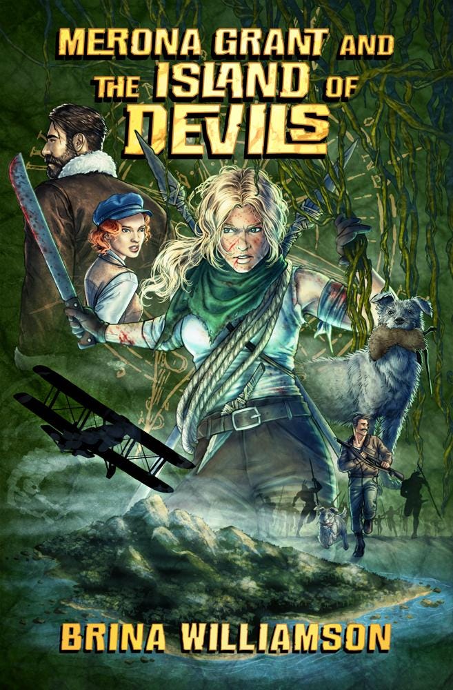
Island of Devils features a gritty Merona at the center, covered in wounds, holding a bloodied machete. Below her is a small action shot of a man running from shadowy pursuers, and a biplane circling a misty island.
Since the setting of the book is an island jungle, this cover is predominantly green, making the opposing color of the yellow/gold text especially pop.
Naturally, as I hone my skills and learn new things, I am always thinking of new ways I could make better covers, and there are always going to be things in past artwork that I would do differently now, but since I’m told regularly that so many of my readers picked up Merona 1 because of the eye-catching cover alone, I’m more than happy with how my covers turned out.
So, now that I’ve talked a bunch about my own covers, let's analyze other great pulp adventure covers and what they get right! Or what they get wrong…
First let’s go over some basic elements I think help make a good cover, versus things that might detract.
Strong, readable title: A lot of covers have small text that doesn’t contrast or stand out from the cover art. This is best avoided, especially in the age of needing to catch the eye with a thumbnail alone. It’s important that your text is clear and readable, but it’s even more of a staple in pulp adventure covers to have bold, high contrast titles. Soft, scrolly text is far more fitting for romance or fantasy. Adventure is best kept bold, like its heroes.
If you are going for that classic look, you also want to avoid too much texture, which can muddy the contrast, and hold your title back from standing out.
Images of action: Pulp adventure is all about action, be it uncovering lost cities, chasing down outlaws, stealing government secrets, or hunting big game in the jungle, the art has to grab the reader with a sense of the kind of adventure awaiting within. It could be a scene of action, or just a general sense of it, but it has to communicate through visual language what kind of adventure awaits.
Striking Imagery: It’s not always enough to just have action on a cover, it’s important that people can clearly see what is going on in the image, be it a collage or single scene. It won’t grab anyone’s attention if it’s too muddy, without a clear, eye-catching focal point.
Color and contrast: You always want to utilize colors, as well as light and shadow to showcase not only the mood, but the key elements of the art. Proper use of colors can make your art pop, as well as set the tone of the story for readers.
A lot of covers of old were loaded with color, since bright colors grab attention, but too many colors can just end up looking messy. If you want to elevate your cover with an updated style, try to stick with only a few complementary colors, like one warm and one cool color, with maybe one other coordinating accent color.
Balanced layout: No matter how many or how few elements you have on your cover, you want to make sure they are balanced and working together harmoniously to create a striking image. Don’t cluster everything in one part of the cover, or try to fill every inch of space without intentionality. Try to make a balanced pattern, or coherent flow to your layout.

Okay, next up, let’s start with these classic pulp novel and magazine covers that I think do a great job catching the eye!
You’ll note the use of primary colors (red, blue, yellow) as I mentioned before, and how those colors are stylistically exaggerated to catch the eye. The snow or desert scenes of the first two covers are strongly blue or yellow, to a degree you are unlikely to see in real life, but art is about capturing a mood, not perfect reality.
The heroes in those first two images aren’t in the midst of action, but they still embody adventure and “men of action” both in their setting, attire, and poses. Having the secondary contrasting color helps the titles of both stand out perfectly, and I especially like the light sources behind each, creating strong silhouettes for our leading men.
The third image’s character is not nearly as much of a focal point as the first two, but since this is an action scene of him hiding behind a canoe in what looks like a shootout between guns and arrows, I think it works well here. This particular one probably has more colors than it needs, I might change that title to yellow, to coordinate with the fire reflected in the water, but overall, I think it’s a great visual design.
The final image of the bandit in black on a black steed, has a great action silhouette against the bright sunset gold sky. The text layout is obviously a cluttered, but it’s a magazine, so that’s to be expected a lot of the time. With a clear, bold title at the top, like the other covers have, this could have easily been my favorite one.

Here is some great, classic pulp art that might very well have been used for covers, but I wanted to analyze the art on its own, to talk a bit about mood, and telling a story through imagery alone.
Let’s start with image one, this one has great mood, and use of light and shadow, and creates intrigue with just the way the woman is gripping her coat, and looking over her shoulder. It can cause the viewer to ask a lot of questions. Is she hiding from someone? Is she getting on a train to flee the country? What is she running or hiding from? Is she a spy who’s stolen government secrets?
Creating an image that makes the audience ask questions can be a great way to get them to read your blurb, or book, to get answers to those questions. And this image does a great job setting a really good mystery mood and invoking a lot of questions.
In image two, we have a great scene of impending action, which has a similar effect to the first image of causing the viewer to ask questions. However, the questions are more immediate, such as, how is he going to get out of this situation? It sets the scene and lets the viewer know there will be action, and the kind of action to expect, but keeps the tension up, leaving us wondering what will happen next.
Image three is a scene in the midst of action, the man and the tiger are in the heat of a fight, and seem to be equally matched. An action image like this creates less tension or anticipation, and much more excitement. Readers are picking up a cover like this for the thrills more than the story.
Finally, we get to image four, which is almost a combination of all three previous images, creating art that has intrigue, immediate action, as well as impending action, setting up a much more clear and complex story.
This image is a great example of art with a great central focal point of the woman in the green dress, who immediately catches the eye, but then has so many smaller details and elements within the art that begin to tell a story. You see her allies in the background, setting dynamite under a bridge, the bridge is marked with a swastika, there is an enemy soldier on the bridge spotting them… Are they about to get caught? Are they going to be able to finish their mission?
There is SO much going on in this single frame of action, which means we can expect a thrilling, complex story to go with it. If the story can deliver on what a cover like this has promised, you’ll have yourself some very happy readers.

These covers are a much more simplistic, graphic art style, very different from the other art we’ve been looking at but still work great and communicate the adventure awaiting within.
Biggles with its bi plane (and tri plane) chasing through the air, leaving contrails behind them, with the dramatic, oversized sun as a backdrop.
King Solomon’s Mines, with a shadowy adventurer framed by the cave arching overhead, and the mist below, all in the red and orange color scheme.
The Lost World, highlighting the silhouetted dinosaur amid a wild landscape.
Or the classic adventurer with a whip, holding a torch and surrounded by ancient carvings.
All of these prove you don’t need highly realistic art to catch the eye or showcase adventure.
The primary flaws I see on these would be some of the title text choices. Biggles with the random pop of purple feels out of place, Solomon’s Mines I feel could be a little bolder, and the title of Lost World would stand out far better if it matched the bright gold color of the sunset backdrop. Indiana’s title is iconic as usual, though.

Here are a few completely different covers from big names, that capture that feeling of action, adventure, exploration, and excitement in all vastly different ways.
The Executioner cover has a sleeker style to its layout, with the vertical title, and I think the collage of characters, locations + flaming helicopter crashing over our hero’s shoulder, all work really well together. Some of the other text could be laid out a little sleeker, but it’s pretty hard to fit that much text on a cover and still keep it looking clean.
I found a lot of cool Tarzan book covers, but this one was one of my favorites, partly because the art is so wonderfully detailed, but I also just love the use of light and shadow to highlight his awesome action pose. The title design is also great, with the cutout of Africa in the R.
This Journey to the Center of the Earth cover I just love, for all the detail of the frame, making it almost feel like a vintage journal chronicling a journey into the unknown, which fits perfectly for Jules Verne’s writing.
The Sahara cover is also a nice example of showcasing adventure through a location and vehicle alone, rather than an action hero or heroine.

Classic pulp adventure books don’t often have a lot of collages but movie posters have some great ones! These are a few newer ones I thought did the collage really well. What I love about a good collage, is the way they have so much to take in, and you are always finding new details you haven’t noticed before.
There are a lot of blue, green, and gold colors in these posters, which follows my earlier point about using cool and warm colors, and makes a very striking combination. They are also all colors found in abundance in nature (blue sky & water, green grass & trees, yellow sun & fire) and so fit the adventure theme nicely.
Also, we have strong themes of maps, compasses, wilderness, sunsets, torches or lanterns, ships and planes, and fire and skulls. All these things communicate exploration, discovery, or danger.
I included 2 variants of Jungle Cruise, because I especially loved the work that was done on the promotional posters for that film, using art rather than just photos of the cast, since hand drawn movie posters are not as common as I feel they deserve to be.

I think The Mummy deserves its own section, because it’s one of my favorite adventure movies, but also because over the years I’ve found some really great cover/poster reimaginings that do a great job with a variety of styles and designs.
The first is much more graphic in its art style, being completely drawn in shades of orange, and frames the characters nicely in a large sun backdrop. The title is a little small and hard to read, but overall I think it’s a great layout.
The second one is framed really nicely by the scarab and book of the dead backdrop, and just has a great art style overall, feeling very reminiscent of pulp move posters of old.
The third is a clear homage to the original mummy movie posters, with the bold title, and the “It comes to life” tagline in the corner. I also love the way the mummy himself is centered at the bottom, in the midst of his ritual to raise his lost love.
And the final one just has such great art, very reminiscent of Drew Struzan, and with so many great details to take in. Again, we have a great backdrop with the book of the dead, framed by torches in all four corners. Our leading couple are largest and prominently featured, while we also have the mummy in both his forms! The title text could stand to be larger, to stop it from blending in as much, but I do like the way it is framed by the mummy minions just above.

To finish up, I think it’s only right to talk about the original 3 Indiana Jones poster designs, by the brilliant Drew Struzan.
What I loved most about the original Raiders of the Lost Ark poster was the way it had Indiana as a great focal point, in his iconic pose with his whip, framed by a wall of ancient carvings as a backdrop, filled with characters and moments from the film. There are so many details to draw you in and build excitement for the story, and which take on even more meaning once you’ve seen the film. The layout is also clean and balanced in its design. I still like a lot about the other collages we’ve looked at, but the layout for Raiders is much more structured than your usual collage, which I love.
Temple of Doom has a much less structured layout than the other two, but it still has a lot to build intrigue, with the elephants at the bottom, and flaming skulls and cultists to the left. Plus, Indy’s gruff, squinting expression on this cover has always been one of my favorite artistic renders of him.
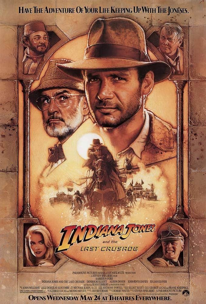
The Last Crusade returns to a similar structured frame as the first poster, showcasing some of the main characters in all four corners. Indy and his dad are a great focal point at the top, and the bright sun at the center of the image, just behind Indy’s hat, highlights the action in the bottom half. This one is quite possibly my favorite. Its layout is clean and eye-catching, yet still full of loads of detail.
I hope you’ve enjoyed my long-winded ramblings about pulp art, and how artists can capture the imagination with a well-designed cover or poster. And, hopefully, if you are a writer or artist like myself, you’ve gained some inspiration for your own covers!
Much of the time when creating my covers, I go on instinct and a well-trained eye, but it was really fun to write this article, analyzing the design process more methodically, and the elements that go into a cover design.
Art like this was definitely what inspired my own venture into writing in this classic genre, and the character of Merona Grant herself was inspired by a childish cover mockup for a book that had no story.
I hope to write many more globetrotting adventures with her, exploring new, undiscovered landscapes, and facing all manner of myths and monsters.
If my work intrigues you, you can find my first Merona Grant novel on Amazon.
I have also partnered with Invictum Digital to adapt my first Merona novel into an Audio Drama series! Complete with immersive sound design, an amazing soundtrack, and a full cast of talented voice actors!
You can listen to the award-winning pilot episode at: invictumdigital.com
Or on YouTube:
If you like what you hear, consider backing our Kickstarter, so we can create more awesome episodes of Merona Grant!
An absolutely GREAT article, Brina (and Frank). Thanks for bringing it to us. I'll share in TNDJ tomorrow, but I'm also adding it to my Writers' Resources over on my main author website.
I always loved this style of covers. They reach out and grab the people browsing the books and gets them to look more closely at what is inside - or just buy it if this portrays what they are looking for to read. Something I would like to have on my books rather than the two- or three-color covers common in many modern books.